 I present exhibit A, my original plan.
The short answer is that the red-orange-yellow multi, was pretty muddy. You could not get a good contrast Which made the second section look like one big blob.
Secondly the red and purple clashed.
Thirdly it looked like a box of crayons puked on my sweater, which was never the intent.
The main trouble I had with this swatch was the realization that my stranded knitting skills were not very good. After knitting most of a stranded sock, this issue has been solved. Walking before running is sometimes helpful.

Borrowing a trick from my fractal experience I switched the MC to black. And I incorporated the blue into one of the larger color blocks.
Basically black is 'not' a color. It contrasts with everything, and makes a color 'appear' as it's true color. White can serve the same purpose, but for whatever reason it is less effective.
I really loved the strong 3 color contrast going on with the yellow, green and pink. I did not like how the blue center motif turned out.

A strong contrast happens in both color (ie blue+orange) and in value (blackness vs. whiteness) Obviously the black is contrasting with everything.
The yellow is actually a darker value than the pink, blue and parts of the green. There is no contrast between the yellow and orange, they probably shouldn't be next to each other.
The silver in the center motif is the only color close to white. It sticks out like a sore thumb. It is calling way too much attention to itself. I don't have light colors, only vivid ones, so the silver needs to go.

I switched the accent colors too. I liked the switch, the orange is green's compliment, and the magenta is yellow's compliment.
The black is too stark, it is too concentrated in places and it isn't counterbalancing the other colors like it did when it was the MC.
Disappointingly this swatch was worse than the last. I concluded that blue was unsuited to be the MC.

The gist I got from this one was that I liked having a contrast at the border between the yoke and the blue, and I missed having the blue incorporated into the yoke as a whole.
The biggest change was that I swatched the full pattern, not just the color blocks. It was interesting to see how the purls smeared and extended colors. Most notably the central motif looks very different in pattern than in color. The accents cover much more of the area.


Obviously I have a long way to go still. Sorry about the blurry picture, this was the best of the bunch, and it is worth showing how freaking small the yoke is. I did the third round of increases, so there are about 25 more rows before the next round of increases.
I am glad I am finally moving again on this sweater. I wasted no time casting on, I was honestly surprised how complicated it was to actually get a good swatch.
MC body: Hortensie
Central motif: Hortensie
MC yoke: Scwartz
Border: Merlot
Points up: Elfe
Points down: Küken
X's: Magnolie
Least accent: Clementine
Most accent: Mon Cheri
One block accent: Küken
Or at least those are my closest guesses for colors. Not all of them were labeled.
In other knitting news, I got a lot done on my socks.


I demonstrated non-baggy flaps. I learned that flaps should be the distance from the ankle bone to the floor, which is 2 3/4 of an inch for me. This flap is 3 inches long, since I was trying to apply the square rule of thumb, and realizing that was crazypants.

As always, the neat, stranded sock inside out shot.


And, on the car ride to and from Chicago, I managed to finish the gusset decreases, and double the butterfly count.
On the fractal front, I made one this week.
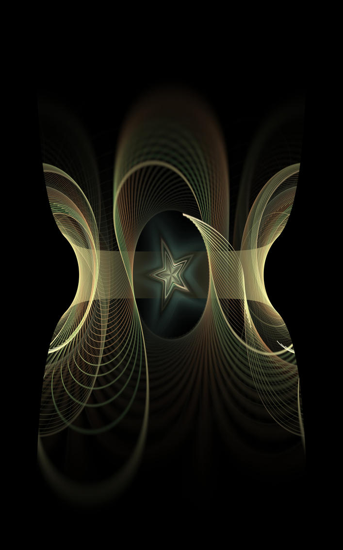
The goal was to make an alien vase. I don't think I will win, I made a rotational with a star center and applied a final transform to make the shape vase-like, nothing fancy. This week the challenge is to use polar, linear and lazysusan. Honestly I have no clue how to make lazysusan really shine.
The department of stashquisitions would like to present, a brand new, dyed by request, skein of Candy Skein (from the same woman who runs WIP Wednesdays) Apparently my stash elephant is still MIA, or rather in a packed box, somewhere in the house.

Please check out the other cool people who are doing for WIP Wednesday!

Molly : )
Girl, just thinking about all that swatching gives me a headache. You're a better woman than I am. ; )
ReplyDeleteHaha, I don't know if it was perfectionism or OCD :D
DeleteI certainly wanted to make it work before I started the yoke of a fingering weight sweater.
It was a big a-ha moment when I made the mini-swatch for the one thing I wanted to double check.
I am amazed at all the swatches, and the thought process. I don't know I would have gone to all that trouble of reasoning out the color variations - I probably would have stuck with "I just don't like it" and moved on. Brava for the endurance to make it right! :) I'm actually swatching, and doing more than one, for a sweater myself! It's amazing what the swatches will tell you. They're like little magic 8-balls for knitting. :)
ReplyDeleteI really wanted it to turn out. I had a lot of time to think, while knitting my swatches :)
DeleteWoo hoo on knitting your own sweater! I hope you make gauge the first time!